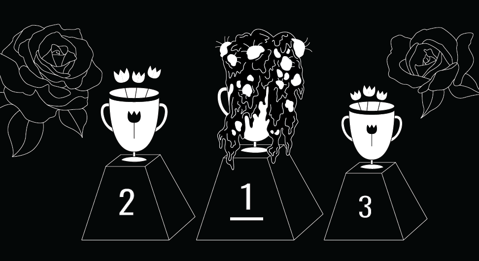
Make it Ugly
No discussion of “ugly” design would be complete (or even begun) without mentioning Craigslist, the enduring bastion of bare bones, kind of cumbersome and pretty ugly. Regardless, a visit to Craigslist feels like coming home. Even though no one would ever make a website like CL now, if it were to get redone with some glossy new interface, there would be an immediate public uproar. This is ugly design at its finest: ugly enough to be instantly recognizable and loved enough to have people want to protect it lest someone should try to push it closer to the world of homogenous “best practices” and colors-of-the-moment design.
The funny thing is, Craigslist was never intended to be ugly—it was intended to be functional and the creators just stopped there (there’s a lesson here, folks). In founder (Craig) “Newmark’s words — a website that can ‘get to the point fast and then stop.’ ”
Craigslist’s accidental aesthetic success should be an inspiration to all of us: Do what CL did accidentally, but intentionally: Make It Ugly. Ugly design is unpretentious but effective: it makes you not only look at but also remember something that otherwise would not have drawn your attention. To create something memorable that doesn’t get lost amongst all the other noise: isn’t that exactly what we all want??! Ugly design is also a welcome alternative to the endless circlejerk of technically sophisticated but conceptually meaningless and entirely forgettable websites and visual debris that litter the internet (I will not implicate any specific dribbble users but you’ve seen what I mean).
What does it mean to make it ugly?
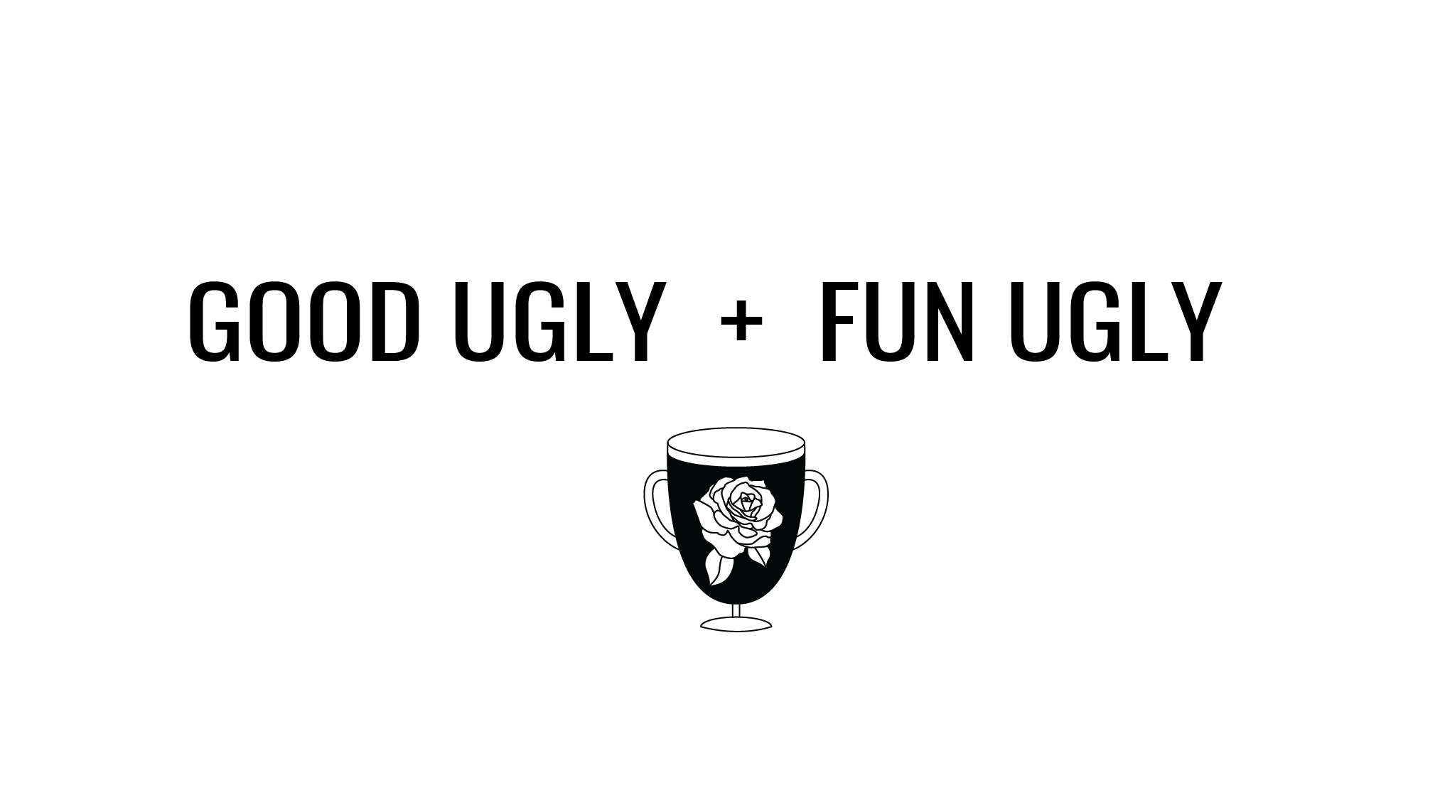
To start, you have to make it “good ugly”—not “bad ugly.” Take, for instance, those script fonts on wedding invitations and inspirational faux-spiritualist quotes—those are “bad ugly.” At face value, the fonts are inoffensive and so ubiquitous that they have become a part of our visual culture and are seen as good design by many consumers. However, this is classic “bad ugly,” primarily because a script font is expected on a wedding invitation or an “inspirational” post—there is no element of surprise. Wedding/inspo script fonts are the basic bitch of fonts, so step one to “good ugly” is to avoid them and anything else that fails to surprise and delight at all costs.
Ok, so “good ugly.” But how? How do we create an element of joy and surprise, which we will call “fun ugly.”
It’s fundamentally instinctual: you stop just short of overworking something (a golden key the fine artists have held for eons). You follow the evolution of what you’re designing to the point that it
1. Does what it’s supposed to do and
2. Brings you pure delight and then you
3. Stop designing right there so you don’t fuck it up.
Basically, you commune with your inner 4-year-old. Back then you didn’t have enough aesthetic or social grounding to cloud your choices—you just walked towards things you were interested in and tried to eat them. You can replicate this feeling today but apply it to liberating yourself from design conventions.
Ok, whatever, this is a little nebulous. On to some examples:
Bad Ugly
http://trendlist.org/
The Craigslist parallel is too obvious and the blue font/color comes from a smug hipster place, like “I know this is ugly but I’m going to do it anyway, look at me.” No surprise factor. Meh.
The Craigslist parallel is too obvious and the blue font/color comes from a smug hipster place, like “I know this is ugly but I’m going to do it anyway, look at me.” No surprise factor. Meh.
The reference to cluttered 90’s websites and tropes is too overt (and the site knows it’s too overt, but still). To its credit, however, “updated by witches” is pretty funny.
Good ugly
Varied rollover functions, not everything in the same category is actually clickable, and the site provides almost no information but is intriguing. I love it.
This is just over the good ugly border because it still feels pretty calculated, but I’m a sucker for small frivolous touches like the clock in the upper right (totally unnecessary) and the delightfulness of the mismatched forward/back arrows, especially paired with high fashion. It’s tongue in cheek: one must laugh.
What I like here is that it’s a choose-your-own-adventure. You can scroll through the mishmash or you can easily organize by category if you’re in a rush or something. A desirable playfulness.
Purgatory ugly (the jury is still out)
http://art.yale.edu/
Although this is a play on shitty 90’s websites, I threw this one a life vest because I guess students can log in and change it. So if you can mess with it, then that makes it cooler and adds exponentially to the potential for surprise and enjoyment.
Although this is a play on shitty 90’s websites, I threw this one a life vest because I guess students can log in and change it. So if you can mess with it, then that makes it cooler and adds exponentially to the potential for surprise and enjoyment.
First off, the content is so good. The zine theme is a little tired, but then again it’s supposed to be. Design is so confusing.
—
There was also (sometime in the last 10 years) a website with this 3-column crazy scrolling mess that was simultaneously awesome and brightly colored and strange. I seem to remember hot pink being featured prominently. Does anyone remember what that was? Please send me a link so I can enjoy it once more.
This work is licensed under a Creative Commons Attribution-ShareAlike 4.0 International License.