The Seeker Part Three: Squiggly Black Lines
Nathan stared at the drop-down font menu and thought of his grandfather—particularly, the night Grandpa Cecil took him out for a drink two days after his 21st birthday.
Sitting in the booth at Holman’s, back when Holman’s had more grandpas than cool kids, Cecil said, “Nathan, you’re a man now, and a man needs a drink. His drink. There’s nothing more pathetic than watching a grown man hem and haw about a beverage while a line of thirsty people forms behind him. Find something you like, whatever it is, and make it yours.”
A decade later, Nathan sat sipping his tequila and orange juice—it had been his drink for years—and said aloud to the computer screen, “A man needs a font.”
“A man needs a font.”
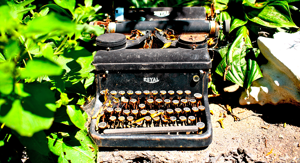
He thought of the old Royal typewriter that Cecil kept on his sideboard: a big, black boat anchor with shiny chrome arms and levers. As a kid, Nathan had mercilessly hammered the keys on the ancient device, spelling nothing, often times not even spinning paper into the machine, just reveling in the powerful shunks and piercing dings. His grandfather had used that Royal his whole life, seven decades of Pica-or-nothin’, and he would surely mock Nathan’s hemming and hawing about which of the hundreds of available typefaces he should use on his resume.
That old Royal was probably the reason Nathan became a writer. His grandparents on his mom’s side would have forbidden the incessant stabbing at the typewriter keys, if they had allowed him to touch it at all. They would have mandated the same gentle, reverent interaction with the machine that they did with their piano, and would have stood over his shoulder to enforce their edict. Nathan grew up believing that pressing hard on a piano key was a sin equivalent to punching the pope, whereas pounding on the old Royal to his heart’s content had no consequences. The only thing Cecil ever said as Nathan rat-a-tat-tatted on the Royal was, “When you’re ready to do more than play, let me know.” Eventually Nathan got curious about the various levers, and his grandfather patiently demonstrated how the typewriter was more fun as a tool than a toy. That’s when he stopped playing and started typing.
Cecil never had to choose a typeface. Scrolling through the font list, Nathan knew that he wasn’t really choosing from all of them. Comic Sans was, of course, off-limits—this was a resume, not a passive-aggressive sign to tape up in the office kitchen. Papyrus was out because Nathan couldn’t forget one of his designer friends dismissing a lunch suggestion with, “I refuse to eat at a restaurant that uses Papyrus on their menu.” Anything that would serve as an appropriate font for captioning clip-art was also eliminated, so Chiller, Broadway, Hobo, Impact, and a slew of others were removed from consideration.
It really came down to the classics; typefaces invented by Ben Franklin or Johannes Gutenberg, but there was shite in that lot, too. Helvetica was legendary, but it was too ubiquitous, the white Honda Accord of fonts. Arial seemed like Helvetica methadone. Times New Roman would certainly please his grandmother, but his grandmother wasn’t hiring.
Times New Roman would certainly please his grandmother, but his grandmother wasn’t hiring.
His default font for copywriting was Calibri, but only because it was Microsoft’s default font and Nathan never bothered to figure out how to change that—and probably wouldn’t have anyway considering the problem he was having now. But as a result, Calibri made his resume feel like a first draft. Frustrated, he googled “best fonts to use for a resume”, then felt utter shame for doing so—not because it was analogous to using a smartphone app to decide on what drink to order at the bar, but because the first link, an article from the heralded design experts at the Huffington Post, listed Helvetica, Arial, and Calibri in their top five. The other two on the list, Georgia and Garamond, were now out by association.
He thought about hiring a freelance designer to layout the resume for him with one of those magical fonts that Microsoft doesn’t think the Office drones of the world deserve, but then he’d probably get three comps back and he’d still have to decide. Besides, he was pretty sure at least one of them would look like Helvetica. You can’t trust a designer to avoid Helvetica, even if you ask them to. It’s like some kind of mothership homing signal.
The fact was, he was simply sick of fussing about it. A resume is a list of qualifications—who the hell cares if your exemplary career is chronicled with serifs or without? Did he really want a job at a place where someone said, “Futura, huh? A common choice for people who want to seem a little cooler than they are.” It would be understandable if he was applying for a design job, but there was no mention of design in the job description. Hell, he could write ad copy in Courier and a designer would make it look wonderful later, so why couldn’t he do that with his resume?
As he stared at the tiny font samples—Microsoft’s decision to show his choices in the actual fonts worked fine for Copperplate Gothic Light, less so for Onyx—every option blurred into a string of squiggly black lines. He couldn’t stand it anymore—he downed the rest of his tequila in a few big gulps and scrolled down the list looking for Pica. If it was good enough for his grandfather, it was good enough for him.
What? No Pica?
Nathan closed the drop-down menu and got up to make himself another drink.
By day, William Reagan is a mild-mannered marketing copywriter stealthily sneaking clever wordplay into the most corporate of collateral—but at night, he’s a creative mischeivian bent on taking the shortest possible path to profound truths and/or preposterous lies. (Still mild-mannered then, too.)
This work is licensed under a Creative Commons Attribution-ShareAlike 4.0 International License.