Year 0 vs Year 3 as a Product Designer – A Retrospective
This piece originally appeared here. It has been lightly edited for our site.
Okay, a little backstory: Nearly three years after its creation, I made a conscious decision to revisit one my first projects in the product design industry.
Well, to put it shortly, it was… horrendous. It resembled the aftermath of an inexperienced, wannabe chef attempting to make a gourmet five-course meal. My face while viewing it was much like that of a disappointed guest that ordered a soufflé and got a mud cake.
I couldn’t believe how terrible it was, but rather than trash it and move on I thought this presented the perfect opportunity for some good ole self-reflection and possibly some redemption.
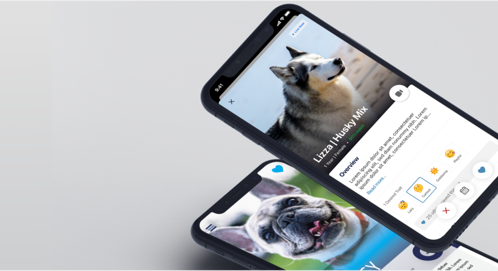
So painful as it is, here we go, my three years of experience worth of pointers on the recipe, past vs present, a rebake if you will.
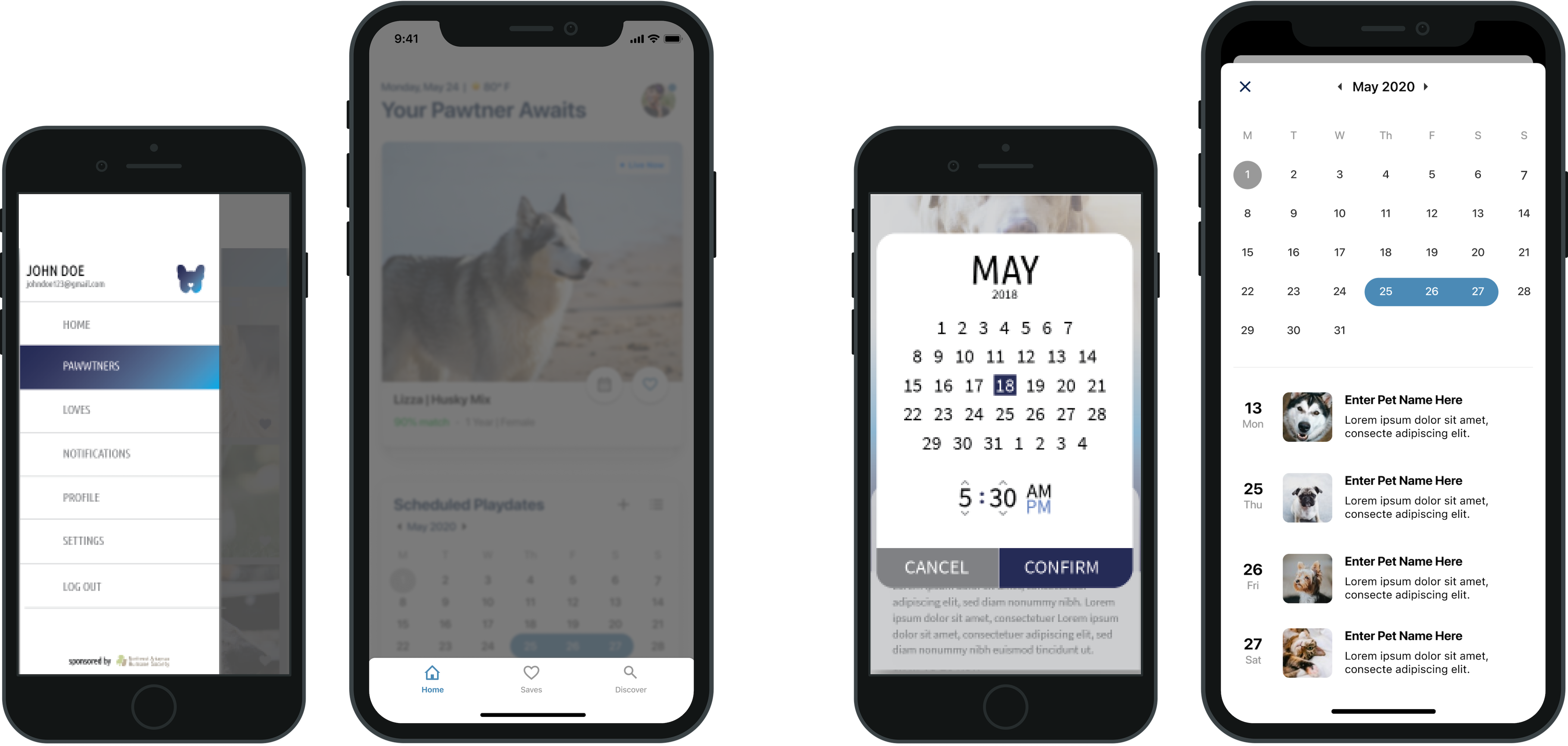
- Summary for context: It’s a pet adoption app merged with the ideals of a dating app (swipe right, swipe left), created in collaboration with my college town humane society.
- The main goal: Provide a solution to expand reach, encourage, and simplify the journey of adopting a furry friend. Secondarily, to automate some of the tedious tasks of setting a pet up for adoption.
Alright let’s get into it:
#1 – Really get to know your party guests
When it came to research, I had bulk (school was great for teaching how to do that) but much of it was quantitative and surface level.
I had the number of guests and that’s about it… no names, no dietary preferences… not good.
Age ranges, statistics, and a competitive analysis are all important pieces of the research phase but in my years working on the job I’ve learned you must go beyond the statistical data to build a successful and more importantly a useful product.
#2 – Pick a Manageable Menu
Filet Mignon, Spaghetti, Sushi, Chicken… oh my.
Rookie mistake alert: I bloated my concept. As I’ve come to learn of even some more mature products, it’s easy to stretch too thin in an attempt to be “feature-rich” but sometimes as a result, as it was in my case, you end up with lackluster and frankly confusing results.

I like to relate this to this master of none theory, and it had a few side effects:
- My case study fell flat
- I put the cart before the horse. I had the intent defined but didn’t follow through. There was a major lack of proper research to guide the development of each feature. Not knowing my audience well, as listed in pointer #1, set up the stage for guessing (which to a degree I would expect a sprinkle of that in a new concept, but not as the basis of an entire product). The features were a mess.
- Gaps in the user experience
- Because my features were half baked, the user journey was lost. Why would someone download this, what problem are you solving, why would they come back?
#3 – Refine my palette, better ingredients
Reign in / Redesign the Design

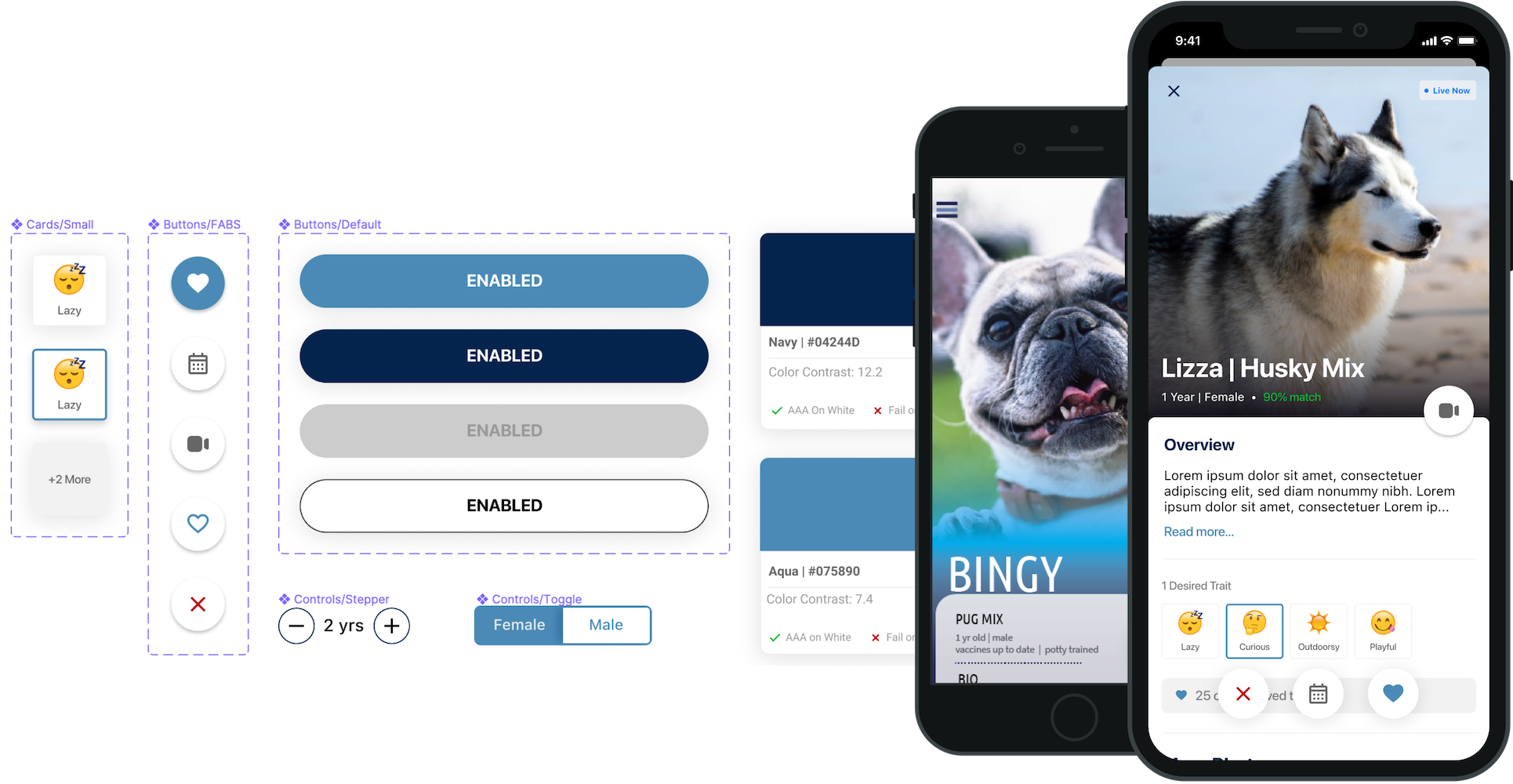
Beyond some of the obvious design errors and the dated style choices (my eyes… they burn), there were several things I didn’t even think to consider, do, or check back then:
- Checking Color Contrast Requirements
- Considering Typography Patterns and Reusable Components (Design System was not in my vocabulary)
- Accounting for touch target sizes
- Understanding the impacts of scale on larger and smaller devices
- Enhancing with interactions or transitions
(This list could go on)
It’s obvious to me now, I focused too much on the aesthetics (and I use that word lightly) and not enough on the experience.
#4 – Setting the Table with the Right Tools
This one has become one of my biggest pet peeves. Imagine you’ve planned this well thought out, appetizing dinner but for some reason, you’ve chosen to set the table with foreign or improper utensils. It seems like a minor detail but you’d be surprised the impact it can have on the experience for your guests. I mean who wants to eat soup with a fork?

Let me clarify: I didn’t consider the platform differences. I didn’t make any considerations to the devices, OS quirks, or navigation differences between platforms. I can’t say that I even took a peek at the Human Interface or Material Guidelines.
Now I reference them almost daily and actively anticipate keynotes and announcements. It was naive of me not to realize the importance of accommodating the application’s host to provide a sense of familiarity and seamlessness to the user. It was also a mistake not to take advantage of the native power. Haptics, shortcuts, native components, the tools to better the experience are endless. (Though I have also since learned one does need to use these utensils with purpose, we don’t want to lean on the side of fancy for fancy’s sake.)
#5 – Second Date Material – There’s No Such Thing As Done
You cant expect a one and done dinner party to result in a batch of new BFFs. Much like relationships, products must be nurtured to reach and push beyond their potential.
At first, I found it frustrating to have to cut back. I had a wishlist a mile long and all of the features were important. MVP was like a curse word . I since have learned the error in my ways.
Test early, ship often, seek user feedback, and iterate. This is the circle of (a product’s) life.
And that’s it (for now). The purpose of this was not to rag on me but rather to reflect on how far I’ve come. My recipe today is still far from perfect but it’s a progression. It’s crazy to think three years ago I was a major newbie to product design. Five years ago I didn’t even know it was a thing, and to this day, I have yet to even scratch the surface of what it has to offer.
I feel extremely blessed to have a job that I’m passionate about. I’ve always had a hunger for learning and an inclination to creative problem-solving. This is part of why I love the tech industry so much. It’s always changing, growing, advancing. There’s always something new to learn and new ways to solution!
So, to my fellow newbs, I leave a message I wish I could leave my past self: hang in there, you probably don’t know as much as you think you do, and what you do know will probably change. But it’s all good. That’s the beauty of the ride with design and technology, enjoy it.
To those further along the journey than I, I welcome you to share your knowledge. And to all, your feedback is welcome!
View the new and improved case study here.
This work is licensed under a Creative Commons Attribution-ShareAlike 4.0 International License.


