Conclusions from The Great Resume Debate 2015—Beyond the Teal
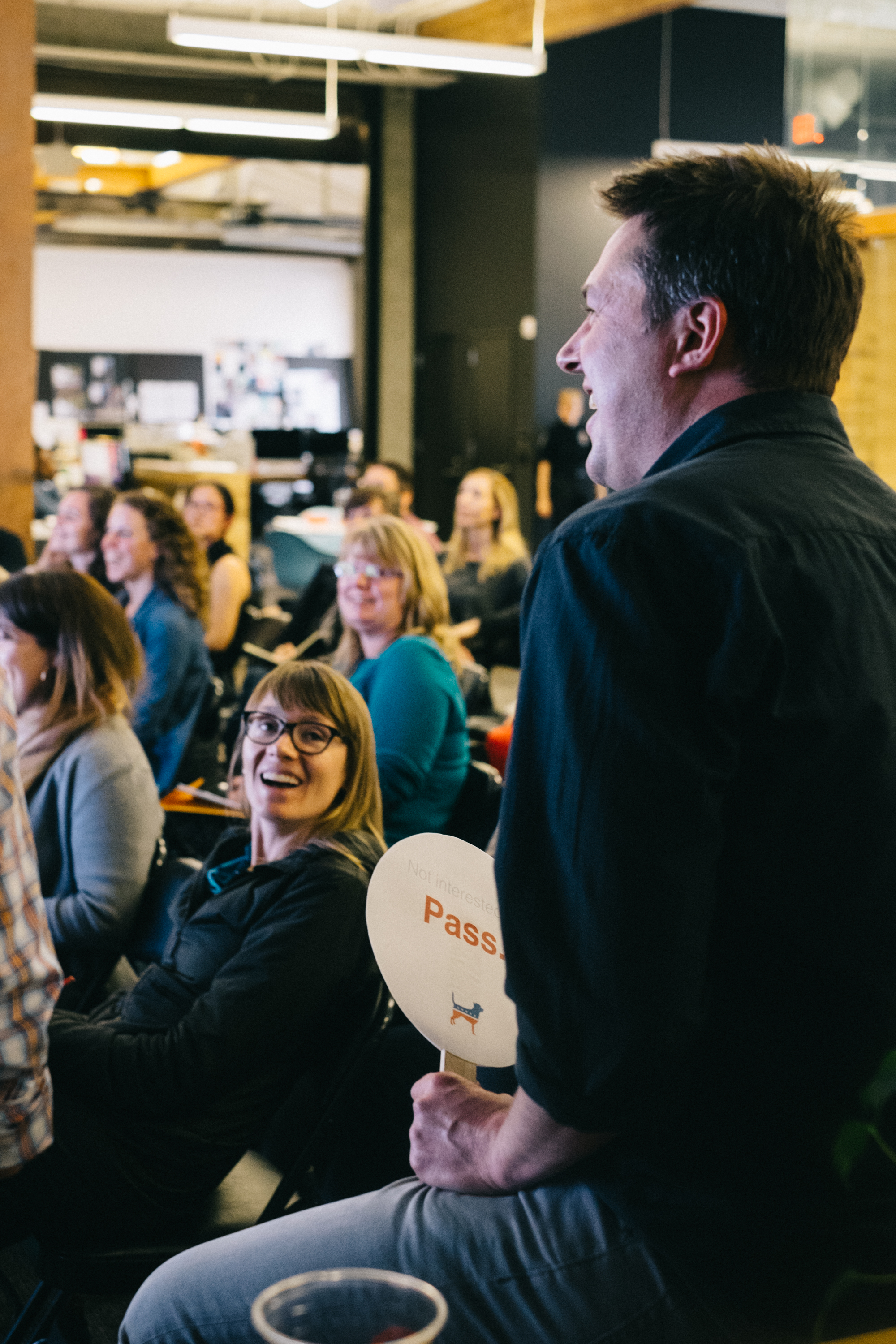
One year after the inaugural Great Resume Debate, combatants Andy Shearer of adidas and Rick Watson of Citizen returned, this year joined by fellow creative recruiter Moira Losch of Swift, united in their dedication to rid the world of crappy resumes, and help get you the job you’ve always wanted.
This year’s debate began with a well-known anecdote—that recruiters spend, on average, five to seven seconds looking at each candidate resume. Such a small window means your credentials need to make an immediate (and positive) impression.
For starters, design flourishes should be functional, not just eye-catching.
“No introductory statements!”
“When I’m looking at design or art direction candidates, if they’re gonna do a designed resume it has to be really good,” Moira said.
Some design decisions can even send unintended messages about your character. Rick pointed out that small font, for instance, makes him feel like the candidate is hiding something.
“For a senior art director, you need to find a thread through your career, and communicate that in a really clean way,” Andy added.
 Yes, structure is equally important. Rick reiterated his decree from last year of, “no introductory statements!” Candidates are applying to solve the organization’s problems, he explained, so to enumerate your career objectives is to miss the point.
Moira noted that while she tends to prefer bulleted resumes, she’s seen long-form writing work in this context as well. More important to her process is seeing the sorts of projects a candidate has worked on.
“It’s going to give me enough to make me go to their website—seeing the brands they’ve worked on,” she said.
Another mantra returned from last year’s debate: no more than two pages! That goes for even the most seasoned software developer or multi-disciplinary project manager. Concisely expressing your ideas is an important professional skill, after all, and where better to demonstrate it than a two-page summation of your entire career.
While you’re narrowing it down, keep in mind that your resume is only part of the equation; a well-crafted portfolio can be the perfect complimentary piece to your application.
“If I see a strong candidate and they have a portfolio site, I’ll look at it, whether they’re a producer or an account manager,” Moira said.
And keep in mind—portfolios can showcase much more than just design work. From your portfolio, recruiters should get an idea of both your process and your role on each project, Rick said.
“You can use your social media footprint in a really positive way.”
Make no mistake about it—your social media presence also plays a big role in recruiters’ evaluations, but it’s not all about catching you in a keg stand.
“You can use your social media footprint in a really positive way,” Andy said. “You can add so much more context around who you are.”
Your resume might include brand accounts you ran for a time, or campaigns that you actively contributed to.
“There are new industries around social media where the roles are very undefined,” Andy continued. “You get a little bit of leeway.”
If you’re transitioning careers, and your resume doesn’t necessarily reflect the position you’re applying for, find a champion who can vouch for your approach and skill set.
“That’s where you write a really great cover letter,” Moira added.
Universally, our panel agreed that it’s always better to apply through an employer’s system rather than cold email. And, even if The Great Resume Debate 2015 has led you to revise your resume from top to bottom, don’t re-apply to the same jobs a second time.
“Don’t flinch,” Rick said.
To glean further insights from the debate, you can watch the event in its entirety above, or check out photos on our Facebook page. See you next time!
This work is licensed under a Creative Commons Attribution-ShareAlike 4.0 International License.

