The Experience of Voting is Broken, But We Can Fix It
When most people think of poor ballot design, they think of Florida, the 2000 election, and Gore vs. Bush.
Unfortunately, the problems and errors that result from poorly designed ballots are a recurring issue. It is estimated that, in the 2008 and 2010 elections, over half a million votes were not counted due to voter errors that could be attributed to poor ballot design.
As a user experience designer, I believe in the power of design to solve a wide range of problems. If we were to look at the current process and experience of voting in the United States, we would be able to quickly identify a number of issues. By then working towards solutions to improve the experience of voting, we could not only increase voter turnout, but also create a more efficient and error-free voting process for everyone.
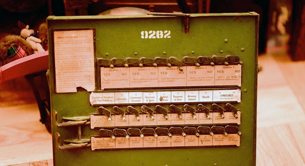
In the United States, the type of ballot, polling machine, and process varies from one local jurisdiction to another.
The problems that have affected elections up until now can generally be grouped into two categories. The first has to do with the huge gap in voting literacy and understanding of our electoral process. It might seem that, given this country’s long history of democracy, that voting would be commonplace and easily understood by its citizens; many people are confused about the electoral process, however, and opt to not even participate. Those who do participate, or at least want to, often find themselves confused about where to go or what to do. Most recently, during the primaries, I heard dozens of stories about confused voters and, possibly more worrisome, confused poll workers who weren’t clear on the process and provided inaccurate information to those showing up to vote.
The second category has to do with ballot design and the actual experience and process of voting. In the United States, the type of ballot, polling machine, and process varies from one local jurisdiction to another. There is no standardized ballot template, so each jurisdiction is left to determine how they want to design their ballots. It’s not clear who exactly is in charge of actually designing these ballots, and there is a good chance that they’re not tested with actual voters to determine if they’re clear, usable, and accurate. Polling machines vary by jurisdiction as well, and until these machines are standardized, we cannot standardize ballots. In the 2006 elections, some areas ran out of paper ballots and some even had their electronic machines breakdown. Fortunately, many of the problems in this second category can be easily solved through better design.
Even more fortunate: a lot of research and thought has already been put into solving these problems by various organizations. Design for Democracy, a strategic initiative of AIGA, the professional association for design, has worked on election design reform since 2000. They’ve developed a whopping 266 page report titled “Effective Designs for the Administration of Federal Elections,” which, as you’ve probably guessed, aims to outline best practices for the design of ballots and polling place voter information materials. According to the report, “Effective information design—design that is based on usability, clarity, and accuracy—is critical to the success of materials and objects whose intent is to communicate complicated ideas to the people who use them.”
For those of us who don’t have time to read a 266 page report, there thankfully exists a summarized version of the top 10 election design guidelines. Some of these seem obvious, such as using big enough type and clear, simple language; but this also suggests that there have been many cases in which these guidelines have not been followed, resulting in errors. Some of the other guidelines are less obvious to non-designers: using lowercase letters is better than ALL CAPITAL LETTERS because they’re more legible, for example. Or acknowledging that left-aligned text is more legible than centered type.
“No legitimate public purpose is served by designs that distort voters’ choices.”
Of course, ballot design is only one factor, albeit a large one. The Brennan Center for Justice also released a (much shorter) report titled “Better Design, Better Elections“, in which they outlined several policy recommendations to prevent design issues that have marred elections. In addition to ballot design, they cover voting machine error messages, provisional and absentee ballot envelopes, and voter education materials. I think they sum up the need for better election design with the following quote:
“Some have dismissed the importance of usability in elections, arguing that voters only have themselves to blame if they fail to navigate design flaws. This misunderstands the purpose of elections. They are not a test of voters’ ability to follow confusing designs or complicated instructions; they are, instead, a mechanism by which voters express their preference for candidates and policies. No legitimate public purpose is served by designs that distort voters’ choices.”
There is clearly a lot of work to be done in order to improve the entire experience of voting. It’s not entirely clear how and when changes will be implemented. That is part of the challenge. But the fact that better design has been recognized as a means by which we can improve the voting experience is a big improvement in and of itself. The rest is hopefully just a matter of time, but change will come faster if more people get involved, especially on a local level.
Ana Khachatrian is a Los Angeles-based user experience designer.

This work is licensed under a Creative Commons Attribution-ShareAlike 4.0 International License.