Designing for Victory – Motifs in Presidential Campaigning
Political campaign design has historically been quite boring: red, blue, maybe a flag, and a safe typeface were more or less what we expected from candidates. But in the past decade, that has all changed.
New technologies mean that candidates who leverage design skillfully build momentum faster, control their narrative more efficiently, and even use design to drum up public support. A “safe” design is still, well, safe, but the right design, set loose on the internet, will campaign for you.
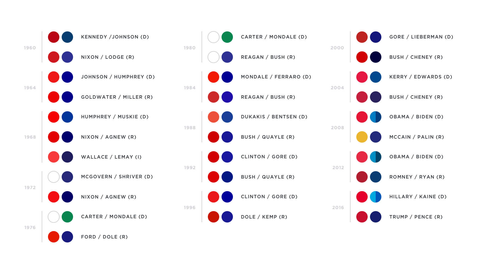
The design shift is evident in the primary colors used by each candidate. Since 1960, both Republicans and Democrats have mostly followed the same color scheme: red, blue, and adjust saturation to current aesthetic trends, or the level of projected conservatism desired. But in 2008, yellow appeared for the first time, as well as an expansion and brightening of primary color palettes.
The internet was shaping the outcome of presidential elections in an unprecedented way, and candidates were able to achieve a competitive advantage by focusing on a digital-first branding strategy. That meant expanding color palettes, sure, but it also meant that candidates had to develop new techniques for standing out in a saturated environment.
Candidates had to learn to achieve split-second recognition and convey complex issues in 140 characters and a jpeg. A brand language that could serve as a meaningful symbol for a candidate meant that they could get in front of more eyes, more easily, and have less explaining to do once they got there.
Analyzing the most successful strategies of the past decade might even provide a peek into the future evolution of an entirely new world of campaign design.
Strategy 1: Embedding a Narrative
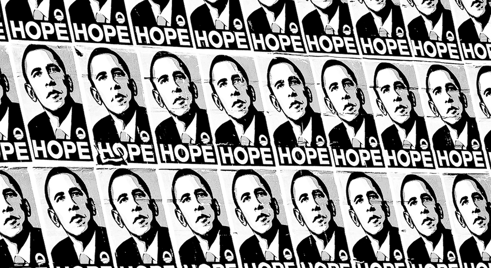
Successful candidates in this new age of branding are able to weave their personal narrative into their design language. Barack Obama did this well with his 2008 campaign typeface choice, Gotham.
The right design, set loose on the internet, will campaign for you.
Gotham was clever for many reasons: it had a hard-working and distinctly American look, but still felt uniquely different from the campaign typography choices that came before it. It was sleek, straightforward, no-nonsense, and a little bit nostalgic for the urban landscapes of America’s heartland. Woven through the campaign typography was an emotional appeal: I am the president of the people. You can trust me. Yes We Can. It was so popular, in fact, that we saw a resurgence of Gotham and similar geometric typefaces in pop culture for many years after the campaign.
But it’s hard to find a typeface that encapsulates the spirit of a campaign, and in fact, whether it could be done again as successfully remains to be seen. Since then, both Obama’s 2012 run and Hillary Clinton’s 2016 run have instead opted to create new, custom typefaces to carefully match their respective narratives.
Strategy 2: Brand Adaptability
One strategy design-savvy candidates have employed is brand adaptability. Both Barack Obama and Hillary Clinton intentionally selected bold, recognizable logo shapes that could be modified for different groups of constituents.
Obama’s campaign worked his mark into the names of each of the 50 states for campaign events, and Hillary uses variants of her mark with different photographic backgrounds depending on the group she’s speaking to.
This branding strategy demonstrates both care for all of the unique pieces that make up a successful campaign, and alliance with the cause. Both Obama and Hillary’s adaptable marks are also optimized to work well in square spaces, which is convenient for supporters to combine or use in place of their social media profile pictures.
![]()
Strategy 3: The Power of Memes
Another strategy we’ve seen in successful campaigns is a true product of the internet age: meme-ability. This doesn’t mean adding some white text over an image, it means knowing how to let the right content loose, and then diligently fanning the flames. The internet is a place where candidates can easily lose control of their own narrative, so it becomes essential to design visual strategies which maintain the brand, even out of context.
Donald Trump’s “Make America Great Again” hats were a successful example of the strategy. We’ve seen a proliferation of parodies, like “Make America Skate Again,” “Make America Great Britain Again,” and even “Make Baseball Caps Blank Again.” In fact, the meme was even weaponized against Trump in campaigns such as John Oliver’s “Make Donald Drumpf Again.”
Unfortunately for his opponents, Trump thrives on attention: positive or negative. The parodies have served to cement and bolster awareness of the meme, not crystalize support against the campaign. In fact, the humor of the parodies really only works if the viewer is aware of Trump’s campaign, which perhaps only makes him more relevant.
These techniques are successful now, but the pace of technology and the four year gap between presidential campaigns makes it difficult to re-use previous candidates’ strategies. How future candidates employ and remix these strategies will determine the future of political campaign design, and will certainly be interesting to watch.
Nikki Clark is a senior designer at thirteen23 and writer with a focus on UX, design systems, digital ethics, and culture. You can read more of her work on Medium.
This work is licensed under a Creative Commons Attribution-ShareAlike 4.0 International License.